I’ve written an article for The Williams Record that seeks to contextualize the unusually warm and light-on-snow January we’ve been experiencing in Williamstown, Massachusetts. As with any piece that connects weather and climate, one of the challenges here was to give people a sense of how this winter stacked up against others, as well as what some important longer-term trends were.
With a lot of data at my disposal, I had a particularly fun time trying to put things in perspective via some infographics, which can do things (such as expressing variance in an intuitive way) that even carefully worded sentences cannot. Because of “finite attention spans” and the “existence of other articles on the page,” not all of the charts I made ended up in the final iteration of the piece — but if you’re so inclined, you can take a look at all of them here. Thanks to the Williams College Environmental Analysis Lab for making all of this super interesting data available to students!
It’s easy to understand that the temperature has been well above average this month, but I thought it would be useful to 1) demonstrate just how consistently so, and 2) give people a benchmark by saying: “Remember that cold snap early last week? That’s average.” It would have been even nicer to use historical average daily temperatures (which I didn’t have access to), but the chart would have looked almost the same anyways.
There are a couple reasons why we might care about the amount of days with snow cover. Not only does it connect with how we perceive wintry weather — through seeing and experiencing snow — but it also helps determine the length and reliability of the season for activities like skiing and snowshoeing. It also reflects significant thaws (like the one that happened around New Year’s this winter) in a way that cumulative snowfall charts do not.
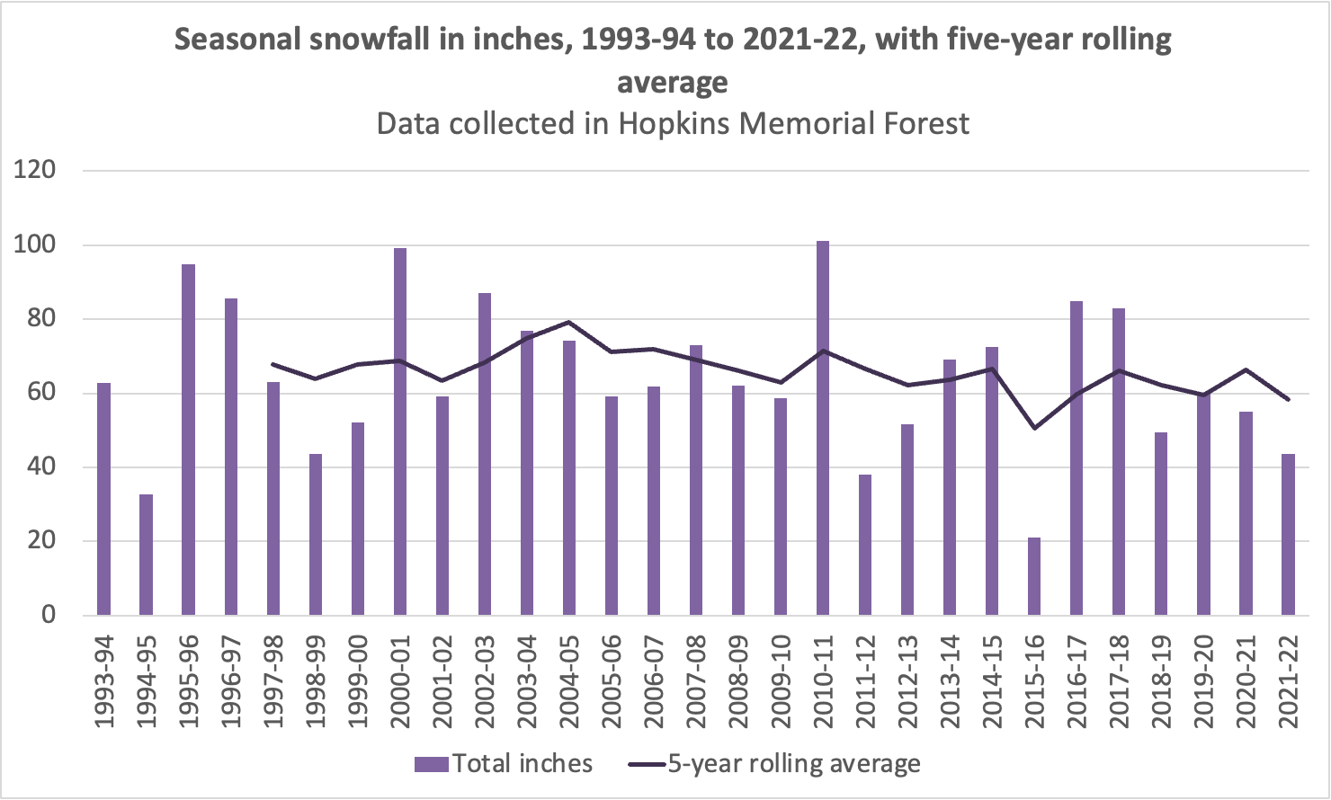
This chart and the last one are attempts to give people a better understanding of the extent to which this season has been warmer and less snowy: It’s not unprecedented, but it’s also below the median year. And there’s a really wide range of possibilities for yearly snowfall.
Another snow-on-the-ground chart. Check out the size of that decrease!
You can see a slight decrease in snowfall over the years here, but it’s not nearly as stark as in the previous chart of snow cover. One possible explanation: Williamstown is warmer now, a change that on its own would decrease annual snowfall — but it’s also receiving more annual precipitation, an effect that would put upward pressure on annual snowfall totals, partially offsetting the overall decline.